ひなたの家

老人ホーム
クリエイター: RURIIRO
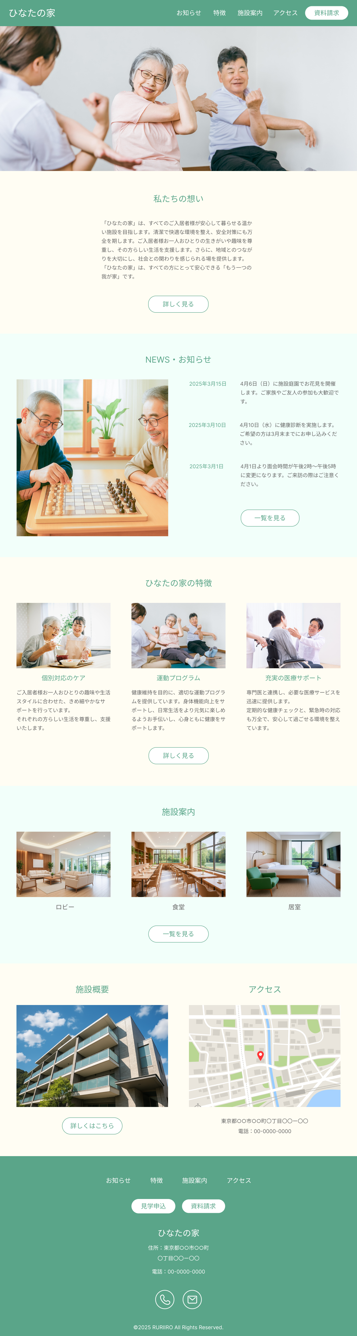
シンプルな老人ホームのウェブサイト(トップページ)です。ドロワー(ハンバーガーメニュー)とスライダーにjQueryを使用しています。

ソースコード
HTML
<!doctype html>
<html lang="ja">

<head>
	<meta charset="UTF-8">
	<meta name="viewport" content="width=device-width, initial-scale=1.0">
	<link rel="stylesheet" href="css/destyle.css">
	<link rel="preconnect" href="https://fonts.googleapis.com">
	<link rel="preconnect" href="https://fonts.gstatic.com" crossorigin>
	<link href="https://fonts.googleapis.com/css2?family=Noto+Sans+JP:wght@400;700&display=swap" rel="stylesheet">
	<script src="https://ajax.googleapis.com/ajax/libs/jquery/3.7.1/jquery.min.js"></script>
	<link rel="stylesheet" href="slick/slick.css">
	<link rel="stylesheet" href="slick/slick-theme.css">
	<script src="slick/slick.min.js"></script>

	<!-- ドロワー -->
	<link rel="stylesheet" href="https://cdnjs.cloudflare.com/ajax/libs/drawer/3.2.2/css/drawer.min.css">
	<script src="https://cdnjs.cloudflare.com/ajax/libs/iScroll/5.2.0/iscroll.min.js"></script>
	<script src="https://cdnjs.cloudflare.com/ajax/libs/drawer/3.2.2/js/drawer.min.js"></script>

	<link rel="stylesheet" href="css/style.css">

	<script src="js/script.js"></script>

	<title>
		ひなたの家
	</title>
</head>

<body class="drawer drawer--right">
<header class="header">
	<h1>
		ひなたの家
	</h1>
	<div class="header-parts">
		<nav class="global-nav-pc">
			<ul class="pc-menu">
				<li><a href="#">お知らせ</a></li>
				<li><a href="#">特徴</a></li>
				<li><a href="#">施設案内</a></li>
				<li><a href="#">アクセス</a></li>
			</ul>
		</nav>
		<a class="documents-button" href="#">資料請求</a>
	</div>
</header>
<button type="button" class="drawer-toggle drawer-hamburger">
	<span class="sr-only">toggle navigation</span> <span class="drawer-hamburger-icon"></span>
</button>
<nav class="drawer-nav global-nav-sp">
	<ul class="nav-list drawer-menu">
		<li><a href="#">お知らせ</a></li>
		<li><a href="#">特徴</a></li>
		<li><a href="#">施設案内</a></li>
		<li><a href="#">アクセス</a></li>
	</ul>
</nav>

<main>
	<div class="slider">
		<picture>
			<source media="(min-width: 800px)" srcset="images/building-slider.jpg">
			<img src="images/building-sp-slider.jpg" alt="施設の外観">
		</picture>
		<picture>
			<source media="(min-width: 800px)" srcset="images/chess-slider.jpg">
			<img src="images/chess-sp-slider.jpg" alt="入居者がチェスをしている">
		</picture>
		<picture>
			<source media="(min-width: 800px)" srcset="images/exercise-slider.jpg">
			<img src="images/exercise-sp-slider.jpg" alt="運動する入居者">
		</picture>
	</div>

	<div class="about">
		<h2>
			私たちの想い
		</h2>
		<p>
			「ひなたの家」は、すべてのご入居者様が安心して暮らせる温かい施設を目指します。清潔で快適な環境を整え、安全対策にも万全を期します。ご入居者様お一人おひとりの生きがいや趣味を尊重し、その方らしい生活を支援します。さらに、地域とのつながりを大切にし、社会との関わりを感じられる場を提供します。「ひなたの家」は、すべての方にとって安心できる「もう一つの我が家」です。
		</p>
		<a class="common-button" href="#">詳しく見る</a>
	</div>

	<div class="news">
		<h2>
			NEWS・お知らせ
		</h2>
		<div class="news-contents">
			<img class="news-image" src="images/chess.jpg" alt="入居者がチェスをしている">
			<div class="news-parts">
				<ul class="news-list">
					<li>
						<h3>
							2025年3月15日
						</h3>
						<p>
							4月6日(日)に施設庭園でお花見を開催します。ご家族やご友人の参加も大歓迎です。
						</p>
					</li>
					<li>
						<h3>
							2025年3月10日
						</h3>
						<p>
							4月10日(水)に健康診断を実施します。ご希望の方は3月末までにお申し込みください。
						</p>
					</li>
					<li>
						<h3>
							2025年3月1日
						</h3>
						<p>
							4月1日より面会時間が午後2時~午後5時に変更になります。ご来訪の際はご注意ください。
						</p>
					</li>
				</ul>
				<a class="common-button" href="#">一覧を見る</a>
			</div>
		</div>
	</div>

	<div class="features">
		<h2>
			ひなたの家の特徴
		</h2>
		<ul class="features-list">
			<li>
				<img src="images/meal.jpg" alt="職員と談笑して食事をしている入居者">
				<h3>
					個別対応のケア
				</h3>
				<p>
					ご入居者様お一人おひとりの趣味や生活スタイルに合わせた、きめ細やかなサポートを行っています。<br> それぞれの方らしい生活を尊重し、支援いたします。
				</p>
			</li>
			<li>
				<img src="images/exercise.jpg" alt="運動する入居者">
				<h3>
					運動プログラム
				</h3>
				<p>
					健康維持を目的に、適切な運動プログラムを提供しています。身体機能向上をサポートし、日常生活をより元気に楽しめるようお手伝いし、心身ともに健康をサポートします。
				</p>
			</li>
			<li>
				<img src="images/consultation.jpg" alt="医師と話す入居者">
				<h3>
					充実の医療サポート
				</h3>
				<p>
					専門医と連携し、必要な医療サービスを迅速に提供します。<br> 定期的な健康チェックと、緊急時の対応も万全で、安心して過ごせる環境を整えています。
				</p>
			</li>
		</ul>
		<a class="common-button" href="#">詳しく見る</a>
	</div>

	<div class="guidance">
		<h2 class="guidance-heading">
			施設案内
		</h2>
		<ul class="guidance-list">
			<li>
				<img src="images/lobby.jpg" alt="ロビー">
				<h3>
					ロビー
				</h3>
			</li>
			<li>
				<img src="images/diningroom.jpg" alt="食堂">
				<h3>
					食堂
				</h3>
			</li>
			<li>
				<img src="images/livingroom.jpg" alt="居室">
				<h3>
					居室
				</h3>
			</li>
		</ul>
		<a class="common-button" href="#">一覧を見る</a>
	</div>

	<div class="wrapper">
		<div class="overview">
			<h2>
				施設概要
			</h2>
			<img src="images/overview.jpg" alt="施設の外観">
			<a class="common-button overview-button" href="#">詳しくはこちら</a>
		</div>

		<div class="access">
			<h2>
				アクセス
			</h2>
			<div class="access-map">
				<iframe
					src="https://www.google.com/maps/embed?pb=!1m14!1m12!1m3!1d6435.481497951662!2d139.53636952147946!3d35.69861814002848!2m3!1f0!2f0!3f0!3m2!1i1024!2i768!4f13.1!5e0!3m2!1sja!2sjp!4v1740839609121!5m2!1sja!2sjp"
					style="border:0;" allowfullscreen="" aria-hidden="false" tabindex="0"></iframe>
			</div>
			<p class="access-address">
				東京都○○市○○町〇丁目〇〇ー〇〇<br> 電話:00-0000-0000
			</p>
		</div>
	</div>

	<footer class="footer">
		<ul class="footer-nav">
			<li><a href="#">お知らせ</a></li>
			<li><a href="#">特徴</a></li>
			<li><a href="#">施設案内</a></li>
			<li><a href="#">アクセス</a></li>
		</ul>
		<div class="footer-buttons">
			<a class="visit-button" href="#">見学申込</a> <a class="documents-button" href="#">資料請求</a>
		</div>
		<h2 class="footer-heading">
			ひなたの家
		</h2>
		<p class="footer-address">
			住所:東京都○○市○○町<br>〇丁目〇〇ー〇〇
		</p>
		<p class="footer-phone">
			電話:00-0000-0000
		</p>
		<div class="footer-icons">
			<a href="#" class="phone-icon"><img src="images/phone-icon.png" alt="問い合わせアイコン"></a>
			<a href="#" class="mail-icon"><img src="images/mail-icon.png" alt="メールアイコン"></a>
		</div>
		<p class="footer-copyrights">
			©2025 RURIIRO all rights reserved.
		</p>
	</footer>
</main>
</body>

</html>
CSS
@charset "UTF-8";

body {
    font-family: 'Noto Sans JP', sans-serif;
    color: #666;
}

p {
    font-size: 16px;
    line-height: 1.7;
}

img {
    width: 100%;
}

h1 {
    font-size: 24px;
    color: #ffffff;
}

h2 {
    font-size: 24px;
    color: #5AA589;
    margin-bottom: 32px;
    text-align: center;
}

h3 {
    font-size: 20px;
    color: #5AA589;
    margin-top: 32px;
    margin-bottom: 16px;
}

.common-button {
    width: 190px;
    height: 56px;
    padding: 16px 43px;
    margin-inline: auto;
    background-color: #ffffff;
    border-radius: 40px;
    border: 1.5px solid #5AA589;
    color: #5AA589;
    font-size: 20px;
    display: flex;
    justify-content: center;
}

/* ヘッダー
---------------------------------*/

header {
    width: 100%;
    height: 71px;
    position: fixed;
    color: #ffffff;
    background-color: #5AA589;
    z-index: 100;
    display: flex;
    align-items: center;
    justify-content: start;
    gap: 30px;
    padding: 20px 15px;
}

.header-parts {
    margin: 0 40px 0 auto;
}

.global-nav-pc {
    display: none;
}

.documents-button {
    display: flex;
    width: 92px;
    height: 30px;
    padding: 4px 15px;
    background-color: #ffffff;
    border-radius: 40px;
    border: 1px solid #5AA589;
    color: #5AA589;
    font-size: 14px;
    justify-content: center;
    align-items: center;
}


/* ドロワー周りの見た目の調整
---------------------------------*/

.drawer-hamburger {
    width: 25px;
    padding: 25px 19px 30px 0;
    text-align: center;
    z-index: 120;
}

.drawer-hamburger-icon,
.drawer-hamburger-icon::after,
.drawer-hamburger-icon::before {
    background-color: #fff;
}

.drawer-overlay {
    background-color: rgba(0, 0, 0, .6);
    z-index: 110;
}

.drawer-nav {
    width: 164px;
    z-index: 120;
}

.drawer--right.drawer-open .drawer-hamburger {
    right: 164px;
}

.drawer-menu li {
    border-bottom: 1px solid #ccc;
}

.drawer-menu li a {
    position: relative;
    display: block;
    padding: 20px;
    text-decoration: none;
    color: #666;
}

.drawer-menu li a::after {
    content: "";
    display: block;
    position: absolute;
    top: 50%;
    right: 10px;
    height: 10px;
    width: 10px;
    border-top: 2px solid #ccc;
    border-right: 2px solid #ccc;
    transform: translateY(-50%) rotate(45deg);
}

/* メイン
---------------------------------*/

main {
    padding: 71px 0 0 0;
    background-color: #FFFDF3;
}

/* スライダーの見た目の調整
---------------------------------*/

.slick-dots {
    bottom: 0;
}

.slick-dotted.slick-slider {
    margin-bottom: 0;
}

.slick-dots li button::before {
    font-size: 15px;
}

.slick-dots li button:hover::before {
    color: #5AA589;
}

.slick-dots li.slick-active button::before {
    color: #5AA589;
}

.slick-prev,
.slick-next {
    width: 30px;
    height: 30px;
}

.slick-prev::before,
.slick-next::before {
    font-size: 30px;
}

.slick-prev {
    left: 5px;
    z-index: 10;
}

.slick-next {
    right: 5px;
}

/* 文章
---------------------------------*/

.about {
    padding: 40px 20px;
    background-color: #FFFDF3;
}

.about p {
    margin-bottom: 40px;
}

.about-detail {
    display: flex;
    justify-content: center;
    width: 190px;
    height: 56px;
    padding: 16px 43px;
    margin-inline: auto;
    background-color: #ffffff;
    border-radius: 40px;
    border: 1.5px solid #5AA589;
    color: #5AA589;
    font-size: 20px;
}

/* お知らせ
---------------------------------*/

.news {
    padding: 40px 20px;
    background-color: #F2FFFA;
}

.news p {
    font-size: 14px;
}

.news-list {
    margin-bottom: 32px;
}

/* 特徴
---------------------------------*/

.features {
    padding: 40px 20px;
    background-color: #FFFDF3;
}

.features-list li {
    margin-bottom: 40px;
}

.features-list li img {
    margin-bottom: 16px;
}

.features-list li h3 {
    margin-bottom: 16px;
    text-align: center;
}

/* 案内
---------------------------------*/

.guidance {
    padding: 40px 20px;
    background-color: #F2FFFA;
}

.guidance li {
    font-size: 20px;
    text-align: center;
}

.guidance-list li h3 {
    margin-top: 16px;
    text-align: center;
}

.guidance-button {
    display: flex;
    justify-content: center;
}

/* 施設概要
---------------------------------*/

.overview {
    padding: 40px 20px;
    background-color: #FFFDF3;
}

.overview img {
    object-fit: cover;
}

.overview-button {
    padding: 16px 23px;
    margin-top: 32px;
}

/* アクセス
---------------------------------*/

.access {
    padding: 40px 20px;
    background-color: #F2FFFA;
}

.access-address {
    text-align: center;
    font-size: 16px;
    margin-top: 16px;
}

.access-map iframe {
    aspect-ratio: 16/9;
    width: 100%;
}

/* フッター
---------------------------------*/

.footer {
    padding: 40px 20px 16px;
    background-color: #5AA589;
}

.footer-nav {
    display: flex;
    justify-content: center;
    flex-direction: column;
    text-align: center;
    gap: 16px;
    margin-bottom: 32px;
    font-size: 20px;
    color: #ffffff;
}

.footer-buttons {
    display: flex;
    justify-content: center;
    margin-bottom: 32px;
    gap: 30px;
}

.footer-buttons .visit-button {
    display: flex;
    text-align: center;
    width: 130px;
    height: 40px;
    padding: 4px 15px;
    background-color: #ffffff;
    border-radius: 40px;
    border: 1px solid #5AA589;
    color: #5AA589;
    font-size: 20px;
    justify-content: center;
    align-items: center;
}

.footer-buttons .documents-button {
    display: flex;
    text-align: center;
    width: 130px;
    height: 40px;
    padding: 4px 15px;
    background-color: #ffffff;
    border-radius: 40px;
    border: 1px solid #5AA589;
    color: #5AA589;
    font-size: 20px;
    justify-content: center;
    align-items: center;
}

.footer-heading {
    color: #ffffff;
    margin-bottom: 16px;
}

.footer-address {
    font-size: 16px;
    color: #ffffff;
    text-align: center;
    margin-bottom: 16px;
}

.footer-phone {
    font-size: 16px;
    color: #ffffff;
    text-align: center;
    margin-bottom: 32px;
}

.footer-icons {
    display: flex;
    justify-content: center;
    gap: 32px;
    margin-bottom: 32px;
}

.phone-icon,
.mail-icon {
    display: block;
    width: 42px;
}

.footer-copyrights {
    text-align: center;
    color: #ffffff;
}

/* ------タブレット用----------- */
@media screen and (768px <= width) {

    h1 {
        font-size: 26px;
    }

    h2 {
        font-size: 26px;
        margin-bottom: 40px;
    }

    h3 {
        font-size: 20px;
        margin-top: 0;
    }

    p {
        font-size: 18px;
    }

    .common-button {
        margin-top: 56px;
    }

    /* ヘッダー
    ---------------------------------*/
    .header-parts {
        display: flex;
        justify-content: flex-end;
        margin: 0 17px 0 auto;
        align-items: center;
        gap: 15px;
    }

    .header .documents-button {
        width: 136px;
        height: 45px;
        padding: 10px 25px;
        font-size: 20px;
    }

    .drawer-hamburger,
    .global-nav-sp {
        display: none;
    }

    .global-nav-pc {
        display: block;
    }

    .pc-menu {
        display: flex;
        padding: 0 10px 0 0;
        align-items: center;
    }

    .pc-menu li a {
        position: relative;
        padding: 20px 10px;
        font-size: 20px;
        text-decoration: none;
        color: #fff;
        transition: 0.2s;
    }

    .pc-menu li a:hover {
        border-bottom: 3px solid #fff;
    }

    .drawer-hamburger,
    .global-nav-sp {
        display: none;
    }


    /* 文章
    ---------------------------------*/
    .about {
        padding: 60px 32px;
    }

    .about p {
        max-width: 590px;
        display: block;
        justify-self: center;
        margin-bottom: 40px;
    }

    /* お知らせ
    ---------------------------------*/
    .news {
        padding: 60px 32px;
    }

    .news-contents {
        display: flex;
        justify-content: center;
        gap: 60px;
    }

    .news-contents img {
        object-fit: cover;
        max-width: 500px;
    }

    .news-list {
        display: flex;
        flex-flow: column;
        justify-content: space-between;
        gap: 30px;
        margin-bottom: 80px;
    }

    .news-list li {
        gap: 20px;
    }

    .news-list li p {
        max-width: 500px;
        font-size: 16px;
    }

    .news .common-button {
        margin-top: 0;
    }

    /* 特徴
    ---------------------------------*/
    .features {
        padding: 60px 32px;
    }

    .features-list {
        display: flex;
        justify-content: center;
        gap: 40px;
    }

    .features-list li {
        margin-bottom: 0;
        flex: 1;
    }

    .features li img {
        margin-bottom: 24px;
    }

    .features li h3 {
        margin-bottom: 24px;
    }

    .features-button {
        margin-top: 40px;
    }

    .features .features-button {
        margin-top: 0;
    }

    /* 施設案内
    ---------------------------------*/
    .guidance {
        padding: 60px 32px;
    }

    .guidance h3 {
        margin-top: 20px;
        color: #666;
        margin-bottom: 0;
    }

    .guidance-list {
        display: flex;
        justify-content: center;
        gap: 40px;
    }

    .guidance-list li {
        flex: 1;
    }

    /* 施設概要
    ---------------------------------*/
    .wrapper {
        padding: 80px 32px;
        background-color: #FFFDF3;
        display: flex;
        justify-content: center;
        gap: 80px;
    }

    .overview {
        padding: 0;
        flex-basis: 50%;
        max-width: 580px;
    }

    .overview-button {
        margin-top: 40px;
    }

    .overview img {
        aspect-ratio: 4/3;
    }

    /* アクセス
    ---------------------------------*/
    .access {
        background-color: #FFFDF3;
        flex: 1;
        padding: 0;
        flex-basis: 50%;
        max-width: 580px;
    }

    .access-map iframe {
        aspect-ratio: 4/3;
        width: 100%;
    }

    .access-address {
        margin-top: 40px;
        font-size: 20px;
    }


    /* フッター
    ---------------------------------*/
    footer {
        padding: 60px 32px 16px;
    }

    .footer-nav {
        flex-direction: row;
        gap: 50px;
    }

    .footer-nav li {
        margin-bottom: 0;
    }

    .footer-nav li a {
        font-size: 20px;
        border-bottom: none;
    }

    footer .visit-button {
        width: 136px;
        height: 45px;
        padding: 10px 25px;
        font-size: 20px;
    }

    footer .documents-button {
        width: 136px;
        height: 45px;
        padding: 10px 25px;
        font-size: 20px;
    }

    .footer-buttons {
        display: flex;
        justify-content: center;
        gap: 24px;
    }

    .footer-address {
        font-size: 20px;
    }

    .footer-phone {
        font-size: 20px;
    }

    .footer-icons a {
        width: 73px;
    }

}

/* ------PC用--------- */
@media screen and (1366px <= width) {

    h1 {
        font-size: 36px;
    }

    h2 {
        font-size: 32px;
        margin-bottom: 56px;
    }

    h3 {
        font-size: 24px;
        margin: 0;
    }

    p {
        font-size: 20px;
        line-height: 1.7;
    }

    /* ヘッダー
    ---------------------------------*/
    header .documents-button {
        width: 168px;
        height: 55px;
        padding: 13px 35px;
        font-size: 24px;
    }

    .pc-menu li a {
        padding: 0 20px;
        font-size: 24px;
    }

    /* 文章
    ---------------------------------*/
    .about {
        padding: 80px 62px;
    }

    .about p {
        display: flex;
        justify-self: center;
        margin-bottom: 56px;
    }

    .about a.about-detail {
        width: 231px;
        height: 65px;
        font-size: 24px;
    }

    /* お知らせ
    ---------------------------------*/
    .news {
        padding: 80px 62px;
    }

    .news-contents {
        gap: 80px;
    }

    .news-contents img {
        max-width: 580px;
    }

    .news-parts {
        min-width: 578px;
    }

    .news-list {
        display: flex;
        flex-flow: column;
        justify-content: center;
        gap: 56px;
    }

    .news-list h3 {
        font-size: 20px;
        max-width: 155px;
        line-height: 1.7;
        flex: 1;
    }

    .news-list li {
        display: flex;
        gap: 40px;
    }

    .news-list li p {
        max-width: 385px;
        font-size: 20px;
        flex: 1;
    }

    /* 特徴
    ---------------------------------*/
    .features {
        padding: 80px 62px;
    }

    .features-list {
        gap: 80px;
    }

    .features-list li {
        max-width: 360px;
    }

    .features-button {
        margin-top: 56px;
    }

    .features a.features-button {
        width: 231px;
        height: 65px;
        font-size: 24px;
    }

    /* 施設案内
    ---------------------------------*/
    .guidance {
        padding: 80px 62px;
    }

    .guidance-list {
        gap: 80px;
    }

    .guidance-list li {
        max-width: 360px;
    }

    .guidance-button {
        margin-top: 56px;
    }

    .guidance a.guidance-button {
        width: 231px;
        height: 65px;
        font-size: 24px;
    }

    /* 施設概要
    ---------------------------------*/
    .overview img {
        aspect-ratio: 4/3;
    }

    .overview-button {
        width: 231px;
        height: 65px;
        font-size: 24px;
        margin-top: 40px;
    }

    /* アクセス
    ---------------------------------*/
    .access-map iframe {
        aspect-ratio: 4/3;
        width: 100%;
    }

    .access p {
        margin-top: 40px;
    }

    /* フッター
    ---------------------------------*/
    .footer {
        padding: 80px 62px 20px;
    }

    .footer-nav {
        font-size: 24px;
        gap: 75px;
        margin-bottom: 56px;
    }

    .footer-nav li a {
        font-size: 24px;
    }

    footer a.visit-button {
        width: 168px;
        height: 55px;
        padding: 13px 34px;
        font-size: 24px;
    }

    footer a.documents-button {
        width: 168px;
        height: 55px;
        padding: 13px 34px;
        font-size: 24px;
    }

    .footer-address {
        font-size: 24px;
    }

    .buttons {
        margin-bottom: 56px;
    }

    .footer-phone {
        font-size: 24px;
        margin-bottom: 56px;
    }

    .footer-icons {
        margin-bottom: 56px;
    }

    .phone-icon {
        width: 73px;
    }

    .mail-icon {
        width: 73px;
    }

    .footer-copyrights {
        font-size: 20px;
    }
}
JS
$(function () {
	/* スライダー(Slick)  */
	$('.slider').slick({
		arrows: true,
		dots: true,
		autoplay: true,
		autoplaySpeed: 4000
	});

	/* ドロワー(ハンバーガーメニュー) */
	$('.drawer').drawer();
});
解説
デモではjQueryとSlick.(プラグイン)を使用してスライダーを実装していますが、難しい場合には画像1枚のみでやってみましょう。また、デモではSlickのボタン表示などをカスタマイズしています。
ハンバーガーメニュー(ドロワー)も同じようにdrawer.jsを使用していますが、こちらも任意です。
まずは、模写コーディングの準備を読んで準備をしましょう。そして、模写コーディングの手順を参考にしながら挑戦してみましょう。